Linear ease / Benefits of avoidance
Linear ease
//also known as
float t => +t;
Lets start with the basic ease… NONE!

Ok so this might be a cheat you think… what ease? Why even have none? Surely it would look terrible , like my boss made this animation for his powerpoint presentation and things are just sliding around the screen. Why use it ever? Well there are reasons, benefits even.
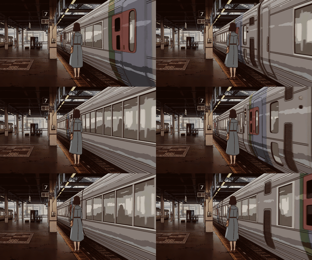
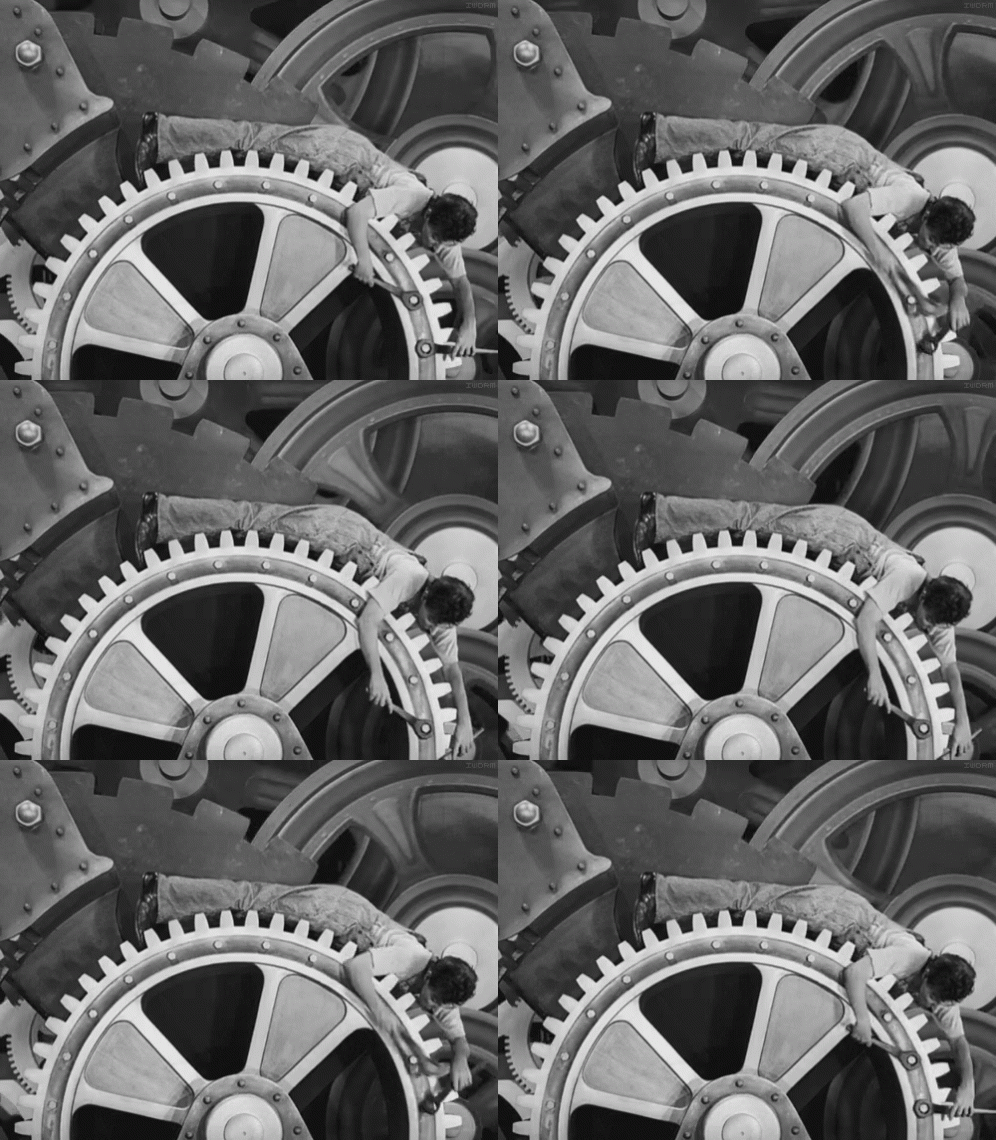
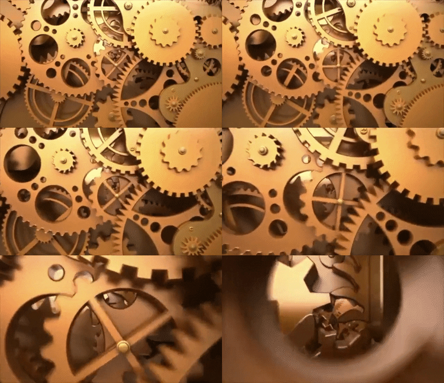
Example 1: Robotics/machinery/ anything mechanical with no inertia
If you’ve got something being driven by a piston or something which exerts forces, sure you would need an ease, but if it’s something which has continuous movement an ease would actually ruin the effect. E.G. (source)
Example 2: Flowing lines
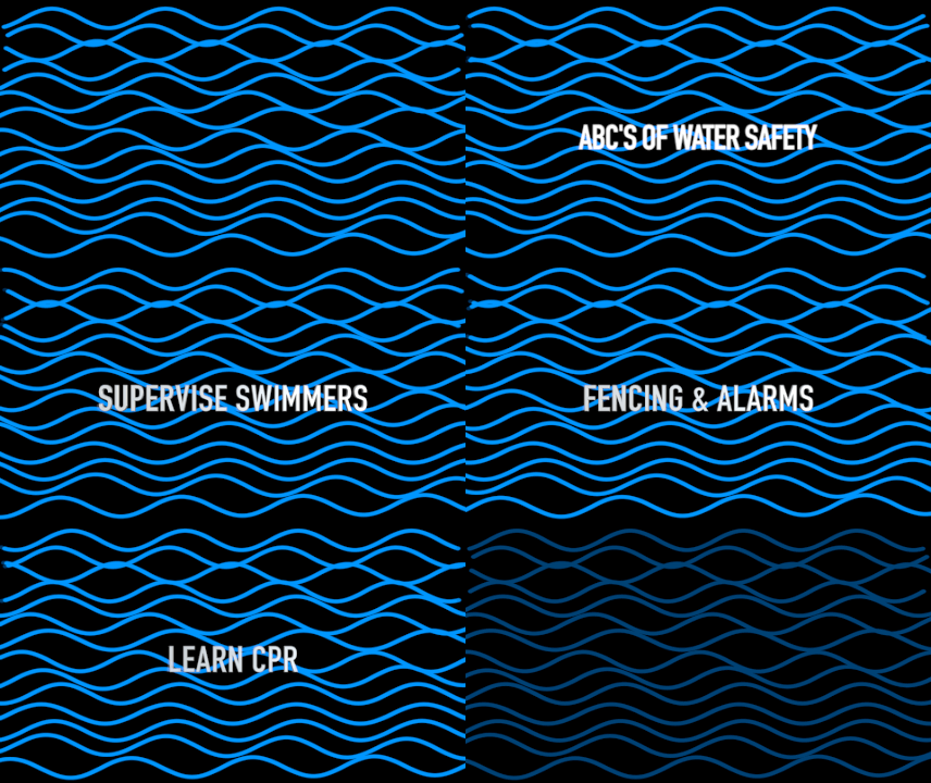
Flowing lines or mography type paths work best when theres little to no easing. Yes sometimes a little ease adds some extra spice but in general the more things arent being eased into position the more relaxing it feels. It has a clean professional look, and its like a great neutral canvas to paint your focus area on to. Or to put fancier tweens at the front. But without the calm the exiting feels less exiting, the contrast needs to be there in my opinion otherwise its all icing no cake.


Example 3: continuous loops
This is more specialized(and overlaps with the lines one I mentioned often) but continuous loops and mind bending gifs need love too, and a looping gif feels perfectly in motion when the overlapping motion is linear. Sure you could put sub eases to individual elements but the more the main parts are linear the more “calm” it feels (gifs from Giphy)
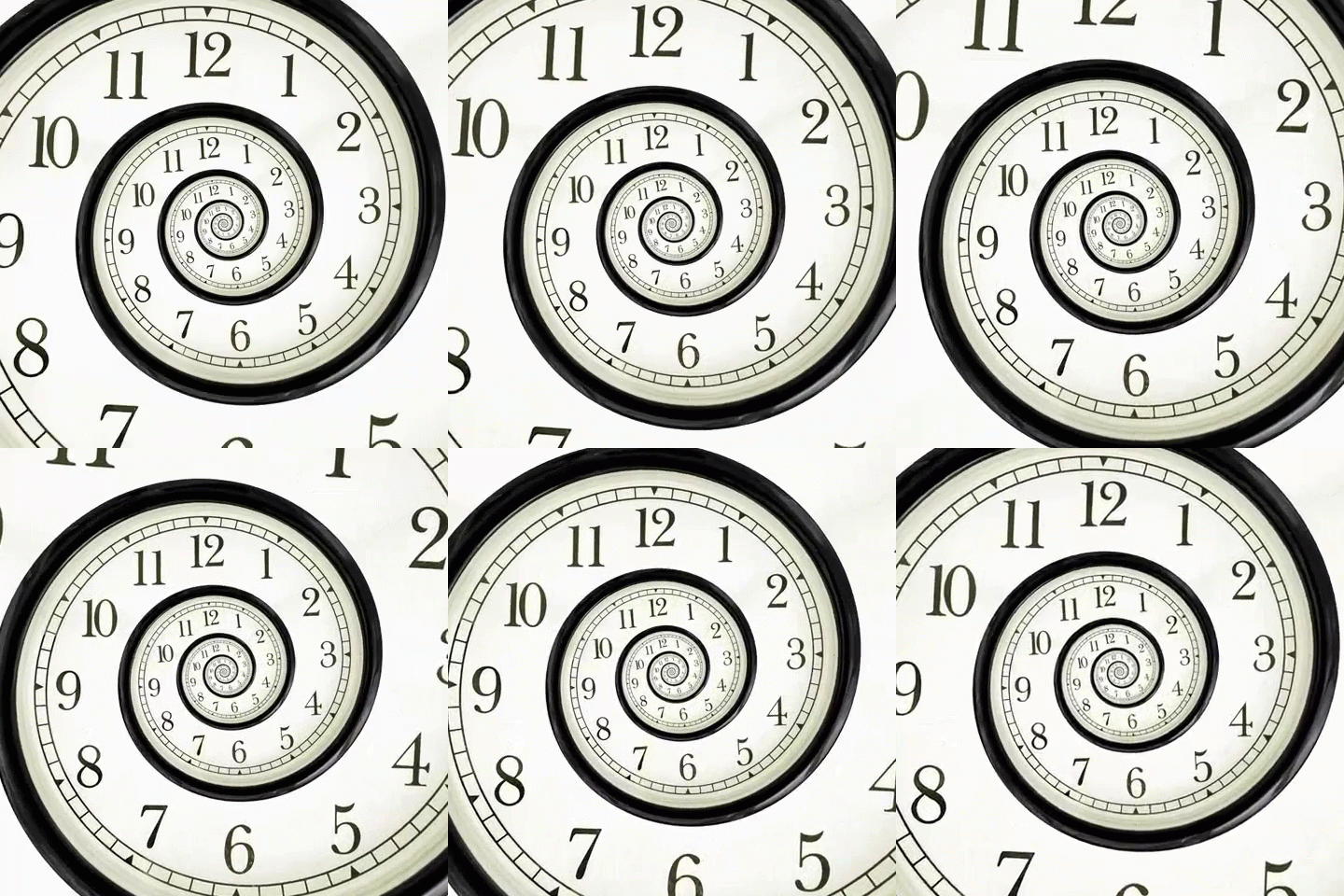
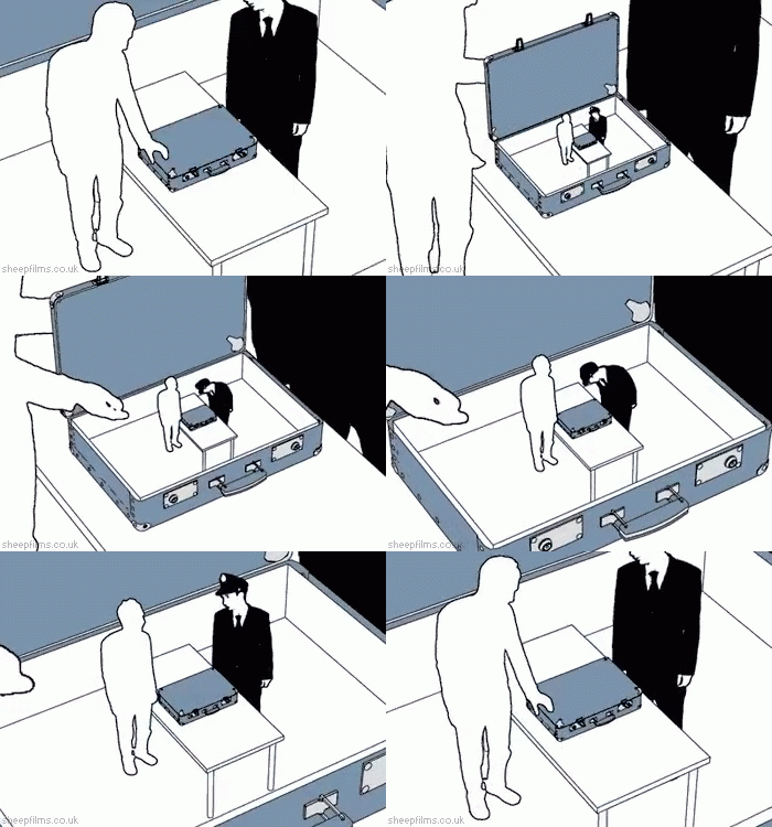
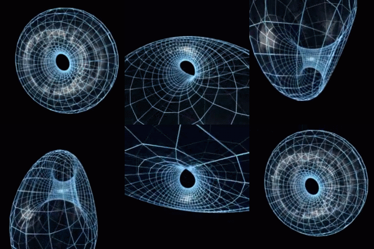
There are many other uses for linear ease, these are just some I just wanted to make a point that lack of ease is sometimes very beautiful and is definetly something that should not be avoided

